Based on the comics by Martin Lodewijk, this short film was meant to be a sort of pilot for a feature film, the first one ever by Blender Studio.
It turns out that even with a strong pilot and a solid record of films under your belt, it is hard to find funding for an animated feature film.
It was super fun though.
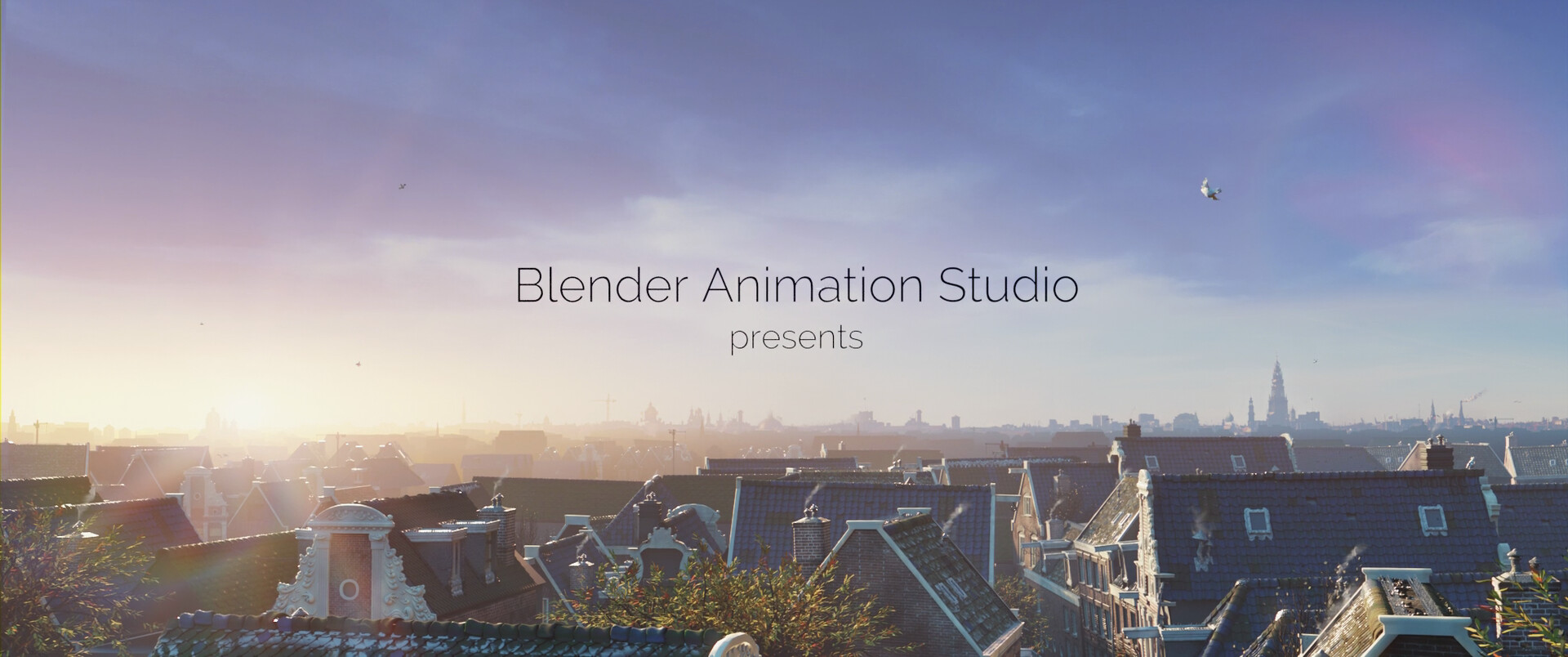
The film starts with the opening shot showing the Amsterdam skyline.
This volumetric light was quite fun to make.
However, it presented quite a challenge for when the camera pans down…
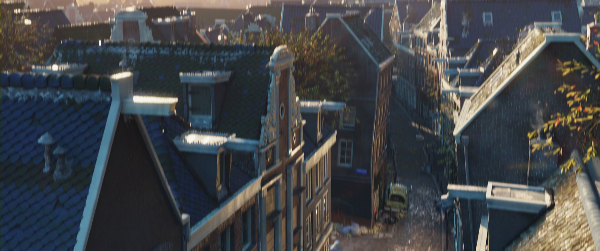
…because we transition to a typical Amsterdam alley where the action takes place on the opposite side of the sun, outdoors, and later indoors, locations which also need to be lit. All in one scene, one .blend file.
We wanted the cake and eat it too.
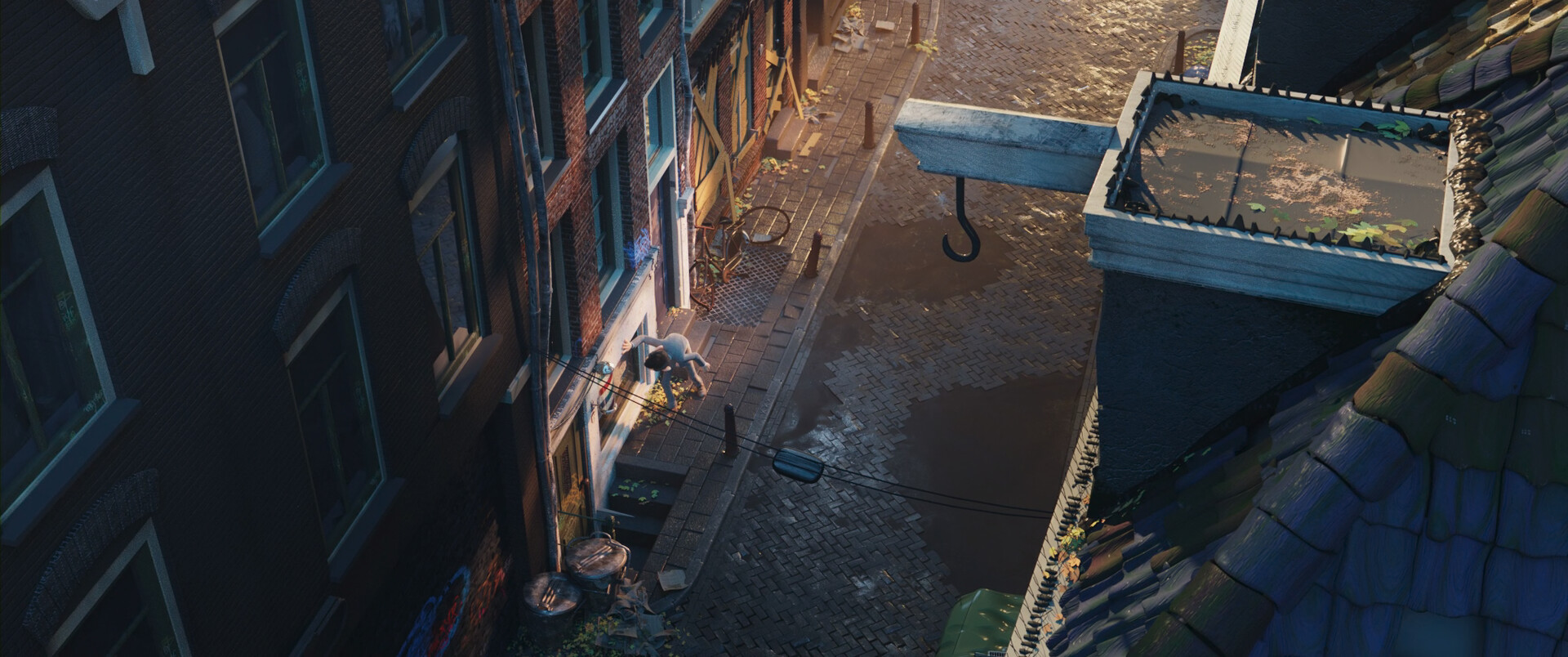
Back then there was no Light Linking in Cycles so I had to get creative: fake sunshine bouncing on the buildings in front.
One of the trickiest shots I’ve ever lit.
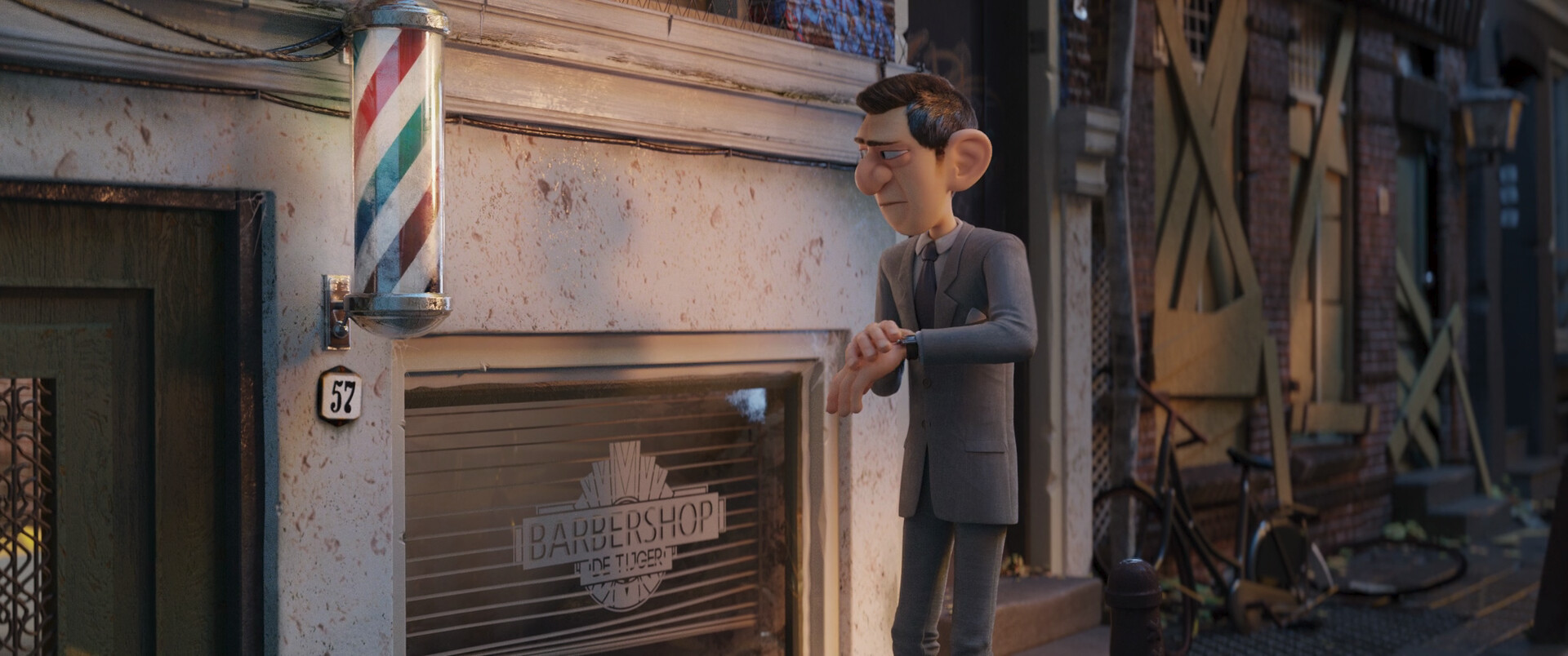
This way I would get a nice, warm light coming from the back, casting soft shadows on the building, which I shaded light and diffuse so we can see the shadow.
The windows on the building behind were blocked for story purposes, but also to avoid distracting reflections. The bikes were a nice touch but in hindsight I would remove them to have less visual noise.
The barbershop swirly thing was fun to make and shade.
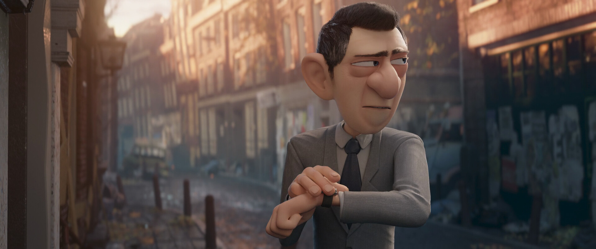
In the next shot we see the building in front, also without reflecting surfaces, and little “amsterdammertjes” which are way too straight now that I look at them. I’d make them crooked pointing towards him to lead the eye to the action.
Lighting-wise the sunshine behind helps the agent to stick out from the background…
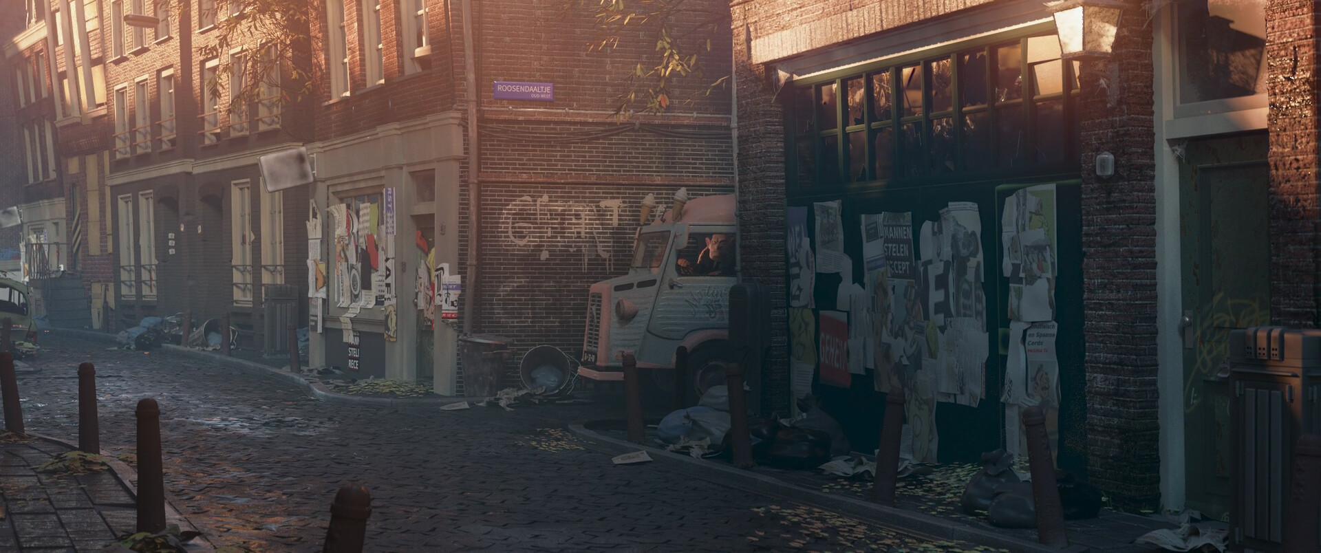
…and allows for contrast when we introduce our antagonist…
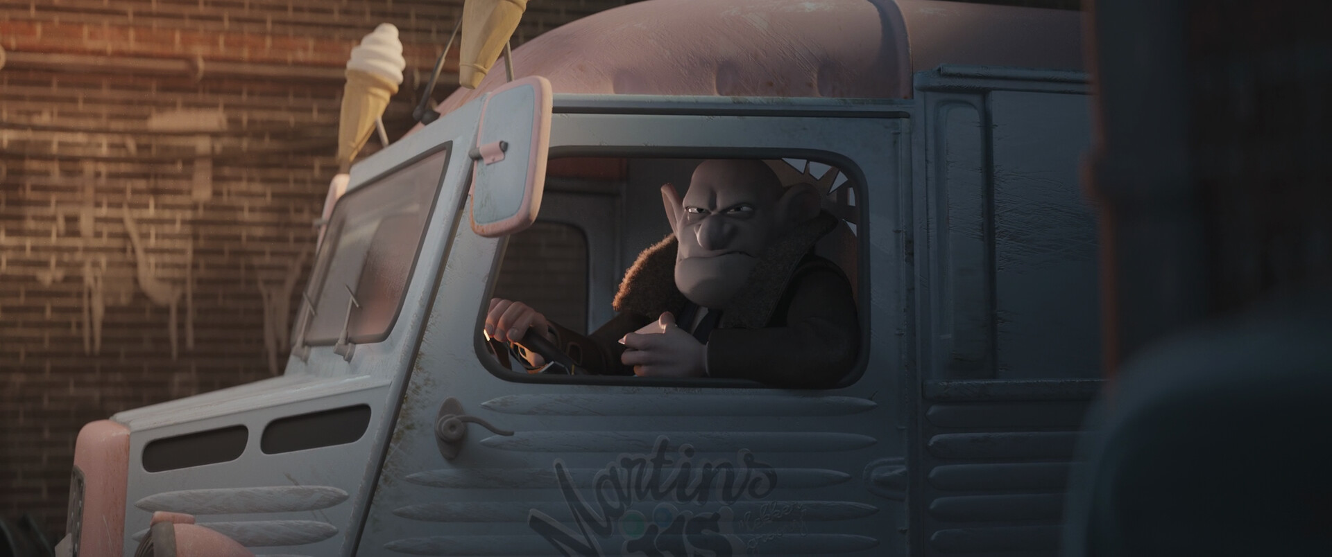
…Boris!
This shot was a mix of fun and pain. Lighting him was so much fun, almost noir style. Lighting the truck was another story, due to its metallic shading and the fact that it had to be half lit, half shaded, by bounce light.
It wasn’t an easy project but I’m pretty happy I got to be part of it.
At the time of writing this Agent 327 has surpassed 8 million views on YouTube, and earned several awards, including People’s Voice Winner at The Webby Awards.
Watch the film on YouTube:
Find more behind the scenes at studio.blender.org
